Column Chart are used to show the measures across various dimensions. Let us consider the table where we have a dimension or qualitative (Category) and measure or quantitative (value).This type of chart is useful when we want to show how the measures are distributed across a single dimension.
Bar Chart are used to show the measures across various dimensions. Let us consider the table where we have a dimension or qualitative (Category) and measure or quantitative (value).This type of chart is useful when we want to show how the measures are distributed across a single dimension.
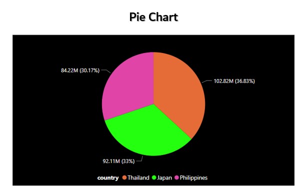
A pie chart is a circle that is divided into areas, or slices. Each slice represents the count or percentage of the observations of a level for the variable. Pie charts are often used in business. Examples include showing percentages of types of customers, percentage of revenue from different products, and profits from different countries. Pie charts can be helpful for showing the relationship of parts to the whole when there are a small number of levels
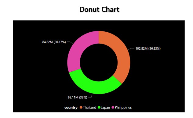
Doughnut charts are like stacked bar charts, curled around itself, such a way that both ends meet and it forms a circle. This chart is preferred over the pie chart because of its data intensity ratio and space efficiency. The hole in the middle of this chart is used to convey extra or additional information, like the total number of data or labels of the arc. Just like Pie charts, doughnut charts too, give a part to the whole relationship. That is, the sum total of all the arc that represent categories, form the whole data
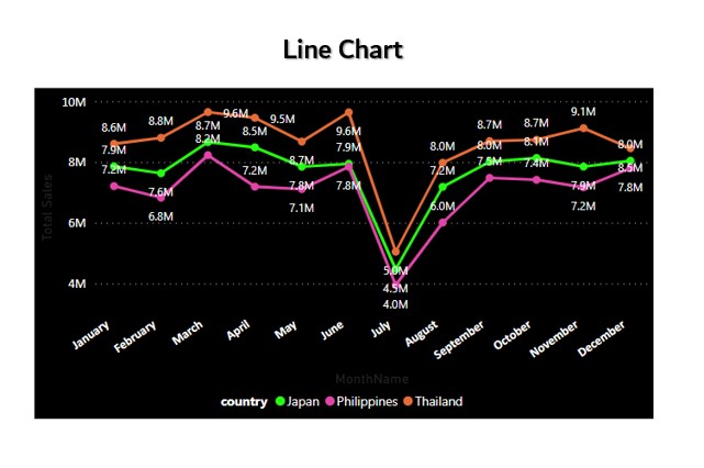
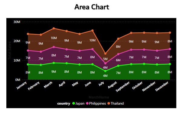
Line graphs, also called line charts, are used to represent quantitative data collected over a specific subject and a specific time interval. All the data points are connected by a line. Data points represent the observations that are collected on a survey or research. The line graph has an x-axis and a y-axis. Line graph helps to analyze the trend of whether the quantity in the y-axis is increasing or decreasing over a period of time. Line graph gives a clear picture of an increasing or a decreasing trend.
Bar Chart are used to show the measures across various dimensions. Let us consider the table where we have a dimension or qualitative (Category) and measure or quantitative (value).This type of chart is useful when we want to show how the measures are distributed across a single dimension.